
A Start…
If a tarot card were a font, which font would it be?
Starting a fun side project as I learn the world of tarot (I’m committed to the bit now) and interpret the cards through my lens. Challenging myself to use only Canva fonts + elements to build a full deck and actually use my grown brain to remember meanings.
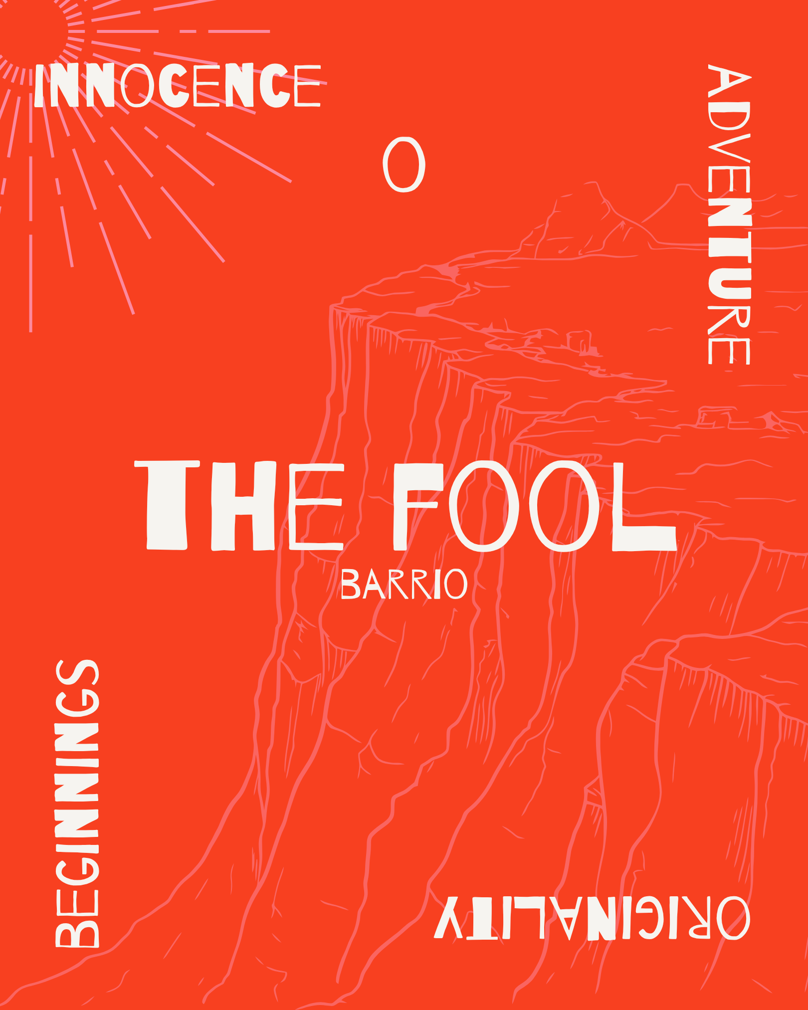
🧳 the fool: the first card of the deck represents adventure, jumping in feet first and thinking later, and perhaps a bit of naivety. barrio embodies the lighthearted nature of this card, though i really wanted to choose comic sans.
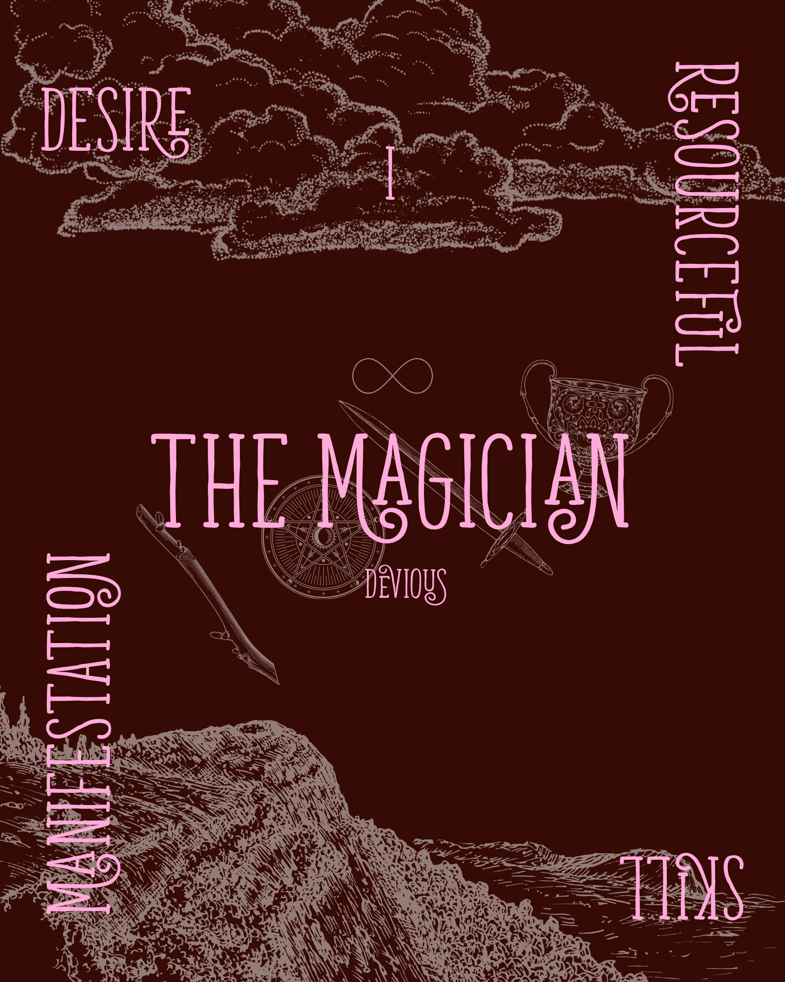
🪄 the magician: a card that represents skill and transmutation, taking all that is available to her and using it to create. devious’ full font book is filled with ligatures and swash characters to create something magical.
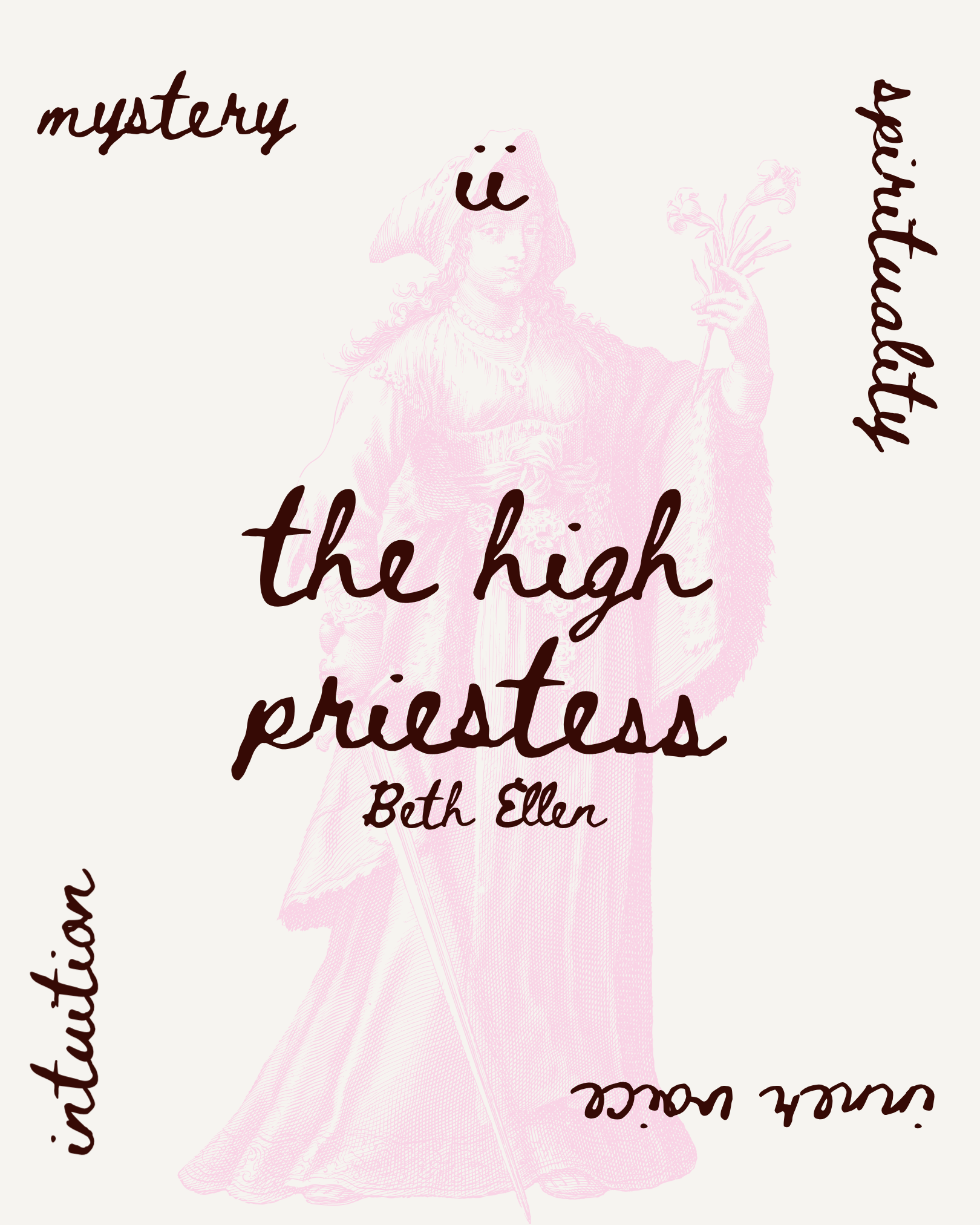
🕯️the high priestess: when this card appears in a reading it is a call inward, tuning and trusting your intuition. the beth ellen font just feels like what would show up if you quick grabbed your journal and free wrote what comes to mind: a little sloppy, but full of power and knowing.
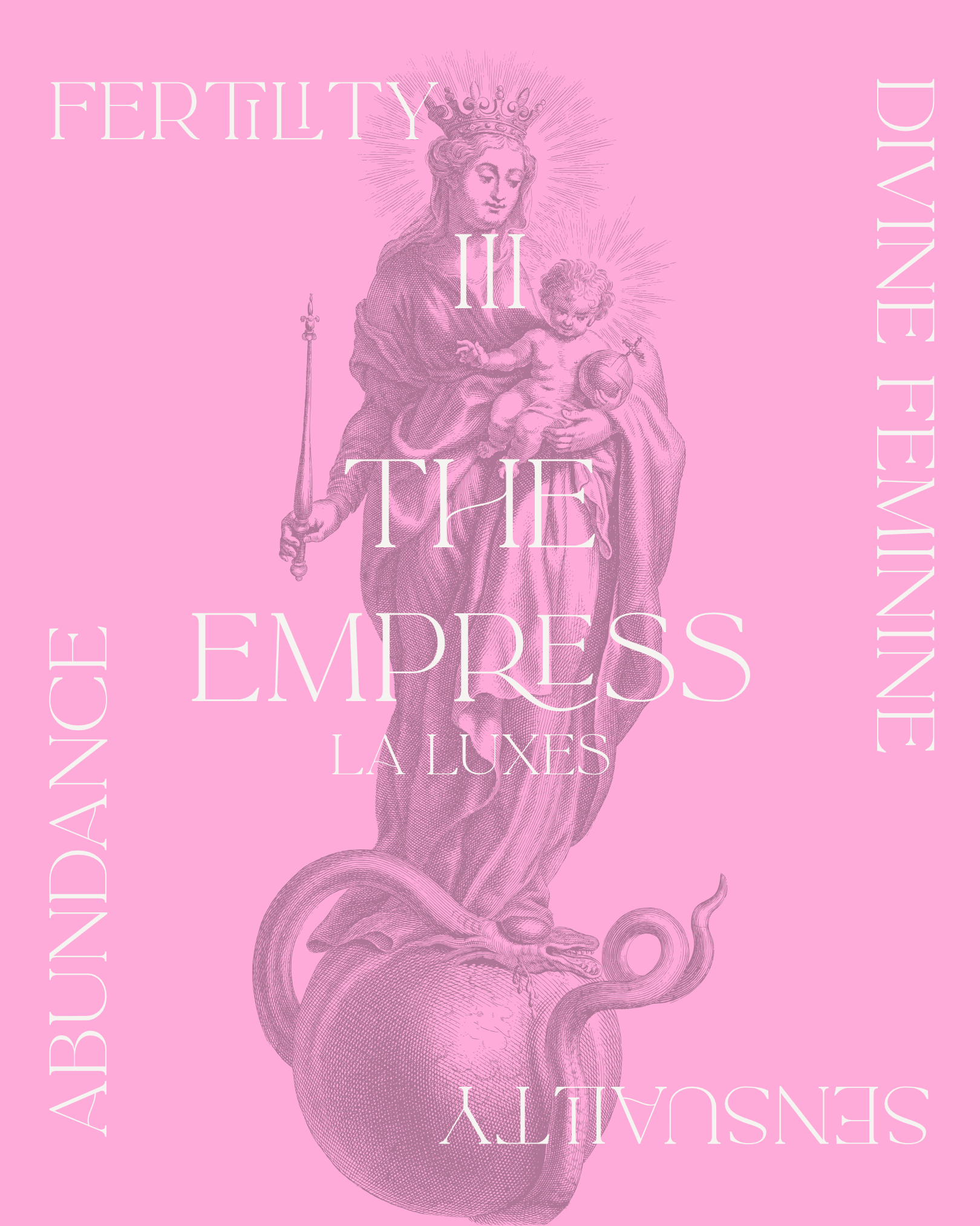
🪺 the empress: a representation of everything divine feminine, she is a nurturing spirit that attracts abundance. la luxes is soft and feminine while still creating impact.
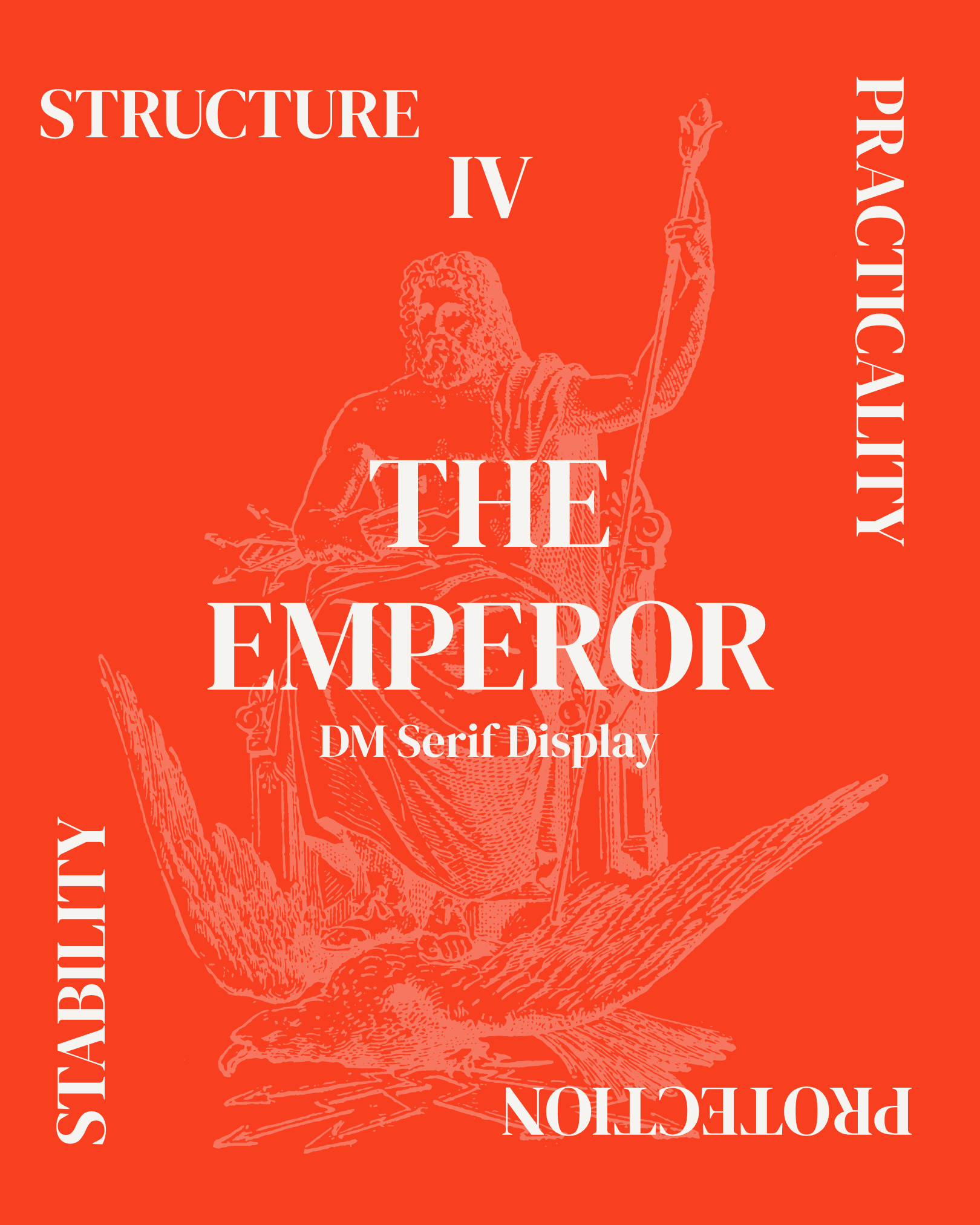
🐏 the emperor: his appearance is a call to protect boundaries and assert authority. dominance, discipline, authority. he leads with head over heart. dm serif display is bold and well-structured (like the fire sign this card represents).
see you for your next reading 🃏